Services employed
Brand
Making sharing easier starts with helping people understand what they can borrow. We created a flexible brand identity for Share Newham, a network of lending hubs funded by East London Waste Authority (ELWA) and the London Borough of Newham.
ELWA is responsible for the sustainable treatment and disposal of waste collected by Barking & Dagenham, Havering, Newham and Redbridge. Alongside four Reuse and Recycling Centres, its Waste Prevention Programme supports residents to reduce the amount of waste they create. Share Newham puts that thinking into practice, giving residents the opportunity to hire household items that can be expensive to buy, bulky to store or only occasionally needed.
ELWA and the London Borough of Newham wanted to encourage residents to share more, supporting both their communities and the environment.The lending hubs were designed to offer friendly, local access to seasonal, specialist and infrequently used household items. Their purpose extended beyond borrowing, creating opportunities for volunteering, learning and building relationships.
Our brief was to develop an engaging, practical logo that made the service easy to understand, including for people whose first language isn’t English. It needed to work across official documents, websites and promotional materials, while allowing the identity to extend to other boroughs in the future.
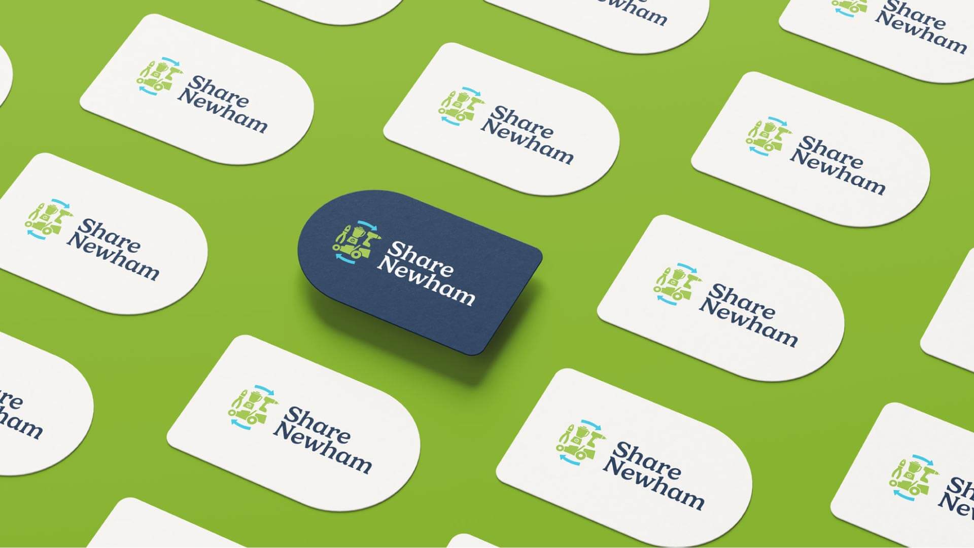
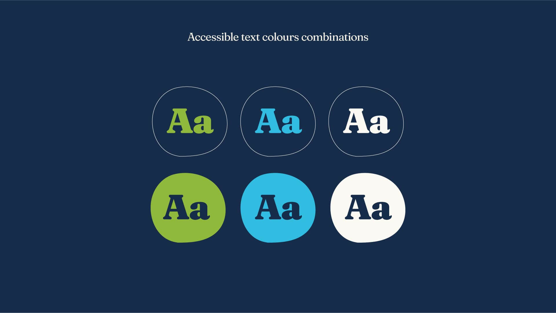
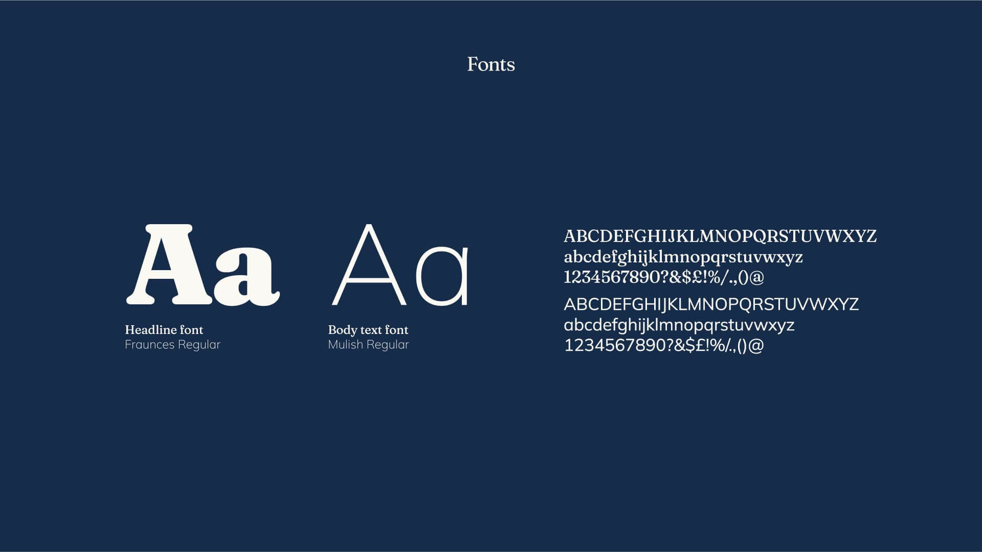
We started with the service itself: what could people borrow, and how could the identity communicate that clearly? Illustrations of objects available to borrow became part of the logo, giving residents a visual introduction to the lending hub. We kept the design clear and direct, with accessibility and readability central to our decisions. We also considered font accessibility and availability to support practical use of the identity. Arrows surrounding the objects express the cyclical nature of sharing, connecting the logo to the project’s waste prevention purpose.
To support future growth, we developed a flexible, modular logo system. Individual elements and colour combinations could change, allowing the identity to adapt to further sharing networks, such as Share Havering. The result is an identity designed around an immediate local need, with room for the wider sharing network to grow.