I just can’t help myself! I’m always looking for different interpretations of popular types of websites, such as e-commerce, landing pages, blogs, or brochure websites. It’s great to see people challenging the way a website is usually designed, and coming up with something that fixes a common problem, or simply makes the website much easier to use.
I spend a lot of time scrolling through Dribble, Awwwards, CSS Awards and Muzli – they’re a great way of keeping up-to-date with what’s going on in the web design world!
Here are some of the things I’ve loved recently…
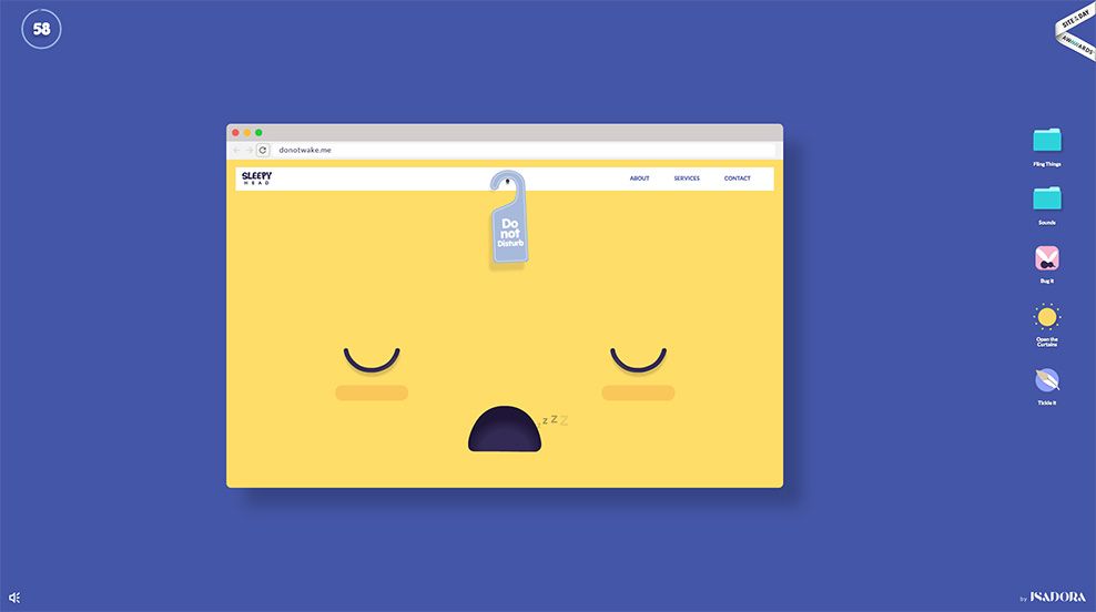
Wake it up
An interactive, animated experience that proves how interaction and animation can deliver a more enjoyable user experience. I love how this simple idea really grasps your attention with the bold illustrations. I also love that it eventually leads you to a well-written, easy to understand, blog post about how and why they made this interactive experience!
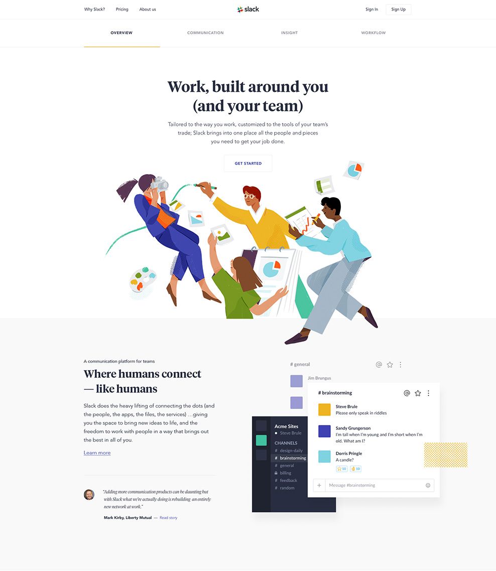
Slack
The talented team at Ueno worked closely with the Slack brand team to attempt to improve conversion and better communicate the brand, and the work they’ve produced is gorgeous. They’ve blended organic illustrations with a super crisp and minimal UI. The use of illustrations helps to bring the screenshots of the Slack UI to life, which could otherwise be a little uninteresting on their own!
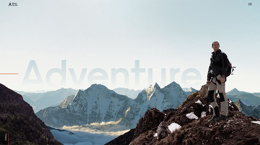
Bear Grylls
The new Bear Grylls website combines interactivity, amazing photography and video, along with a simple but interesting layout. Everything from the hero, to the full-screen menu is super bold and eye-catching. The animation is crisp and adds that extra special detail to the site.
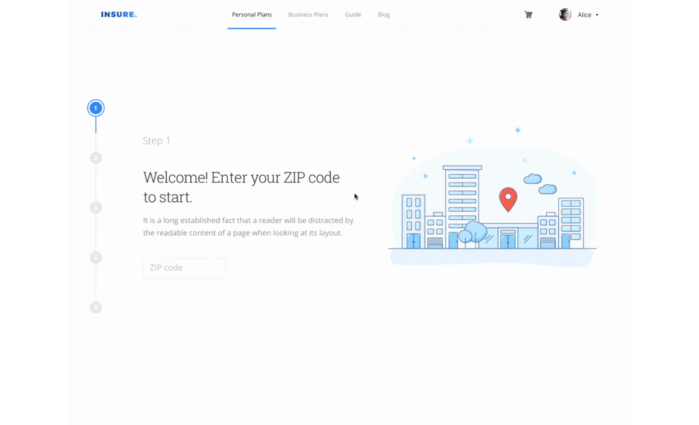
Insurance form
I really love the simplicity of this form. It’s split into 5 simple step, each one is easy to understand with a simple question, brief description and sometimes has a couple of conditional logic inputs – nothing’s ever overwhelming to the user. Each step is even accompanied by an illustration – the whole experience feels quick, easy and friendly!
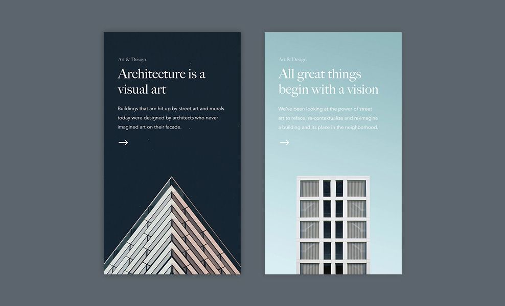
Card Components
I love the simplicity of these card components, the typography is lovely, and the buildings fit into the card perfectly – they really grab your attention and point you towards the button!
Stay tuned for more posts about what inspires the team here at Carbon!